
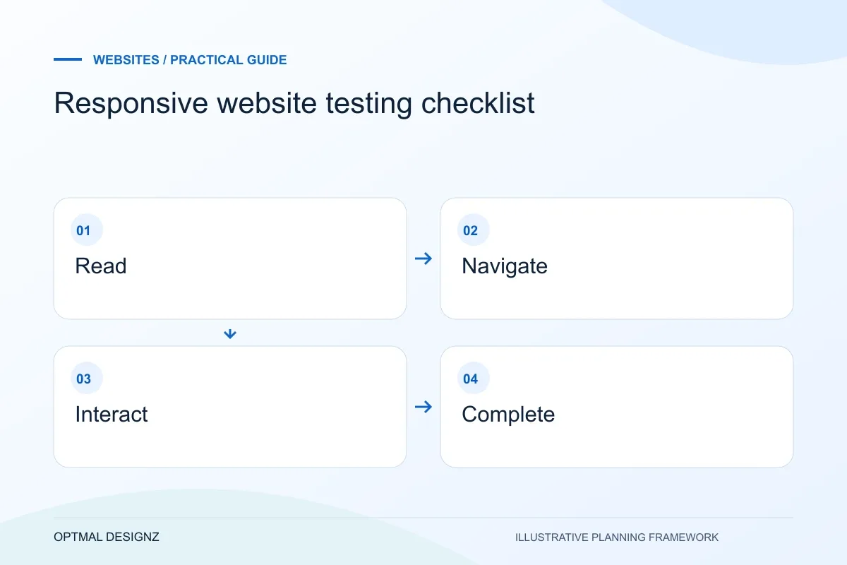
The decision this guide helps you make
Responsive website testing checks whether real tasks work across different screens and input methods. It covers readable content, navigation, forms, images, keyboard access and confirmations, not only whether the layout shrinks.
Test mobile navigation, readable content, touch controls, forms and layout behaviour using real customer tasks rather than device screenshots alone.
Use complete tasks at representative viewport widths and on actual devices where possible. Check failures, zoom, focus and long content before accepting the design.
A practical example to test the choice
Test a visitor opening a service menu, comparing two offers and sending an enquiry on a small screen. A button can look correct in a screenshot yet become unreachable when the keyboard opens.
This is an illustrative planning scenario, not a claim about a completed client project. Use your own records and operating rules to confirm whether the approach fits.
Choose tasks before choosing devices
A responsive layout is useful when people can complete their tasks across screen conditions. Identify the important journeys: comparing services, finding delivery information, completing an enquiry or buying a product. Test those journeys rather than relying only on a homepage screenshot at a few familiar widths.
Include a narrow screen, an intermediate width and a larger display. Try portrait and landscape where relevant, and use more than one input method. A layout can look tidy while a dropdown, date picker or fixed banner makes the actual task frustrating.
Check reflow, reading and controls together
W3C’s reflow guidance addresses presenting content without unnecessary two-dimensional scrolling, with specified exceptions. Use it as a reference when reviewing narrow layouts and zoom. Tables, diagrams and long values need considered handling rather than being silently cut off.
Review touch targets and spacing against the applicable accessibility criteria, including W3C’s target-size guidance and its exceptions. For practical testing, check whether adjacent actions are easy to distinguish and operate. Do not shrink labels or remove meaningful information simply to force everything into one row.
Finish the transaction and record failures
Open and close menus, dismiss overlays, change a selection and submit a form with an error. Check that the keyboard does not hide the next action, focus remains visible and the visitor can understand how to recover. Fixed headers should not obscure anchored headings.
Record the route, viewport, browser, input method and steps for each issue. Prioritise failures that block an important task, then address reading comfort and consistency. A responsive review complements accessibility and performance testing; it does not replace either or certify every possible device.
Ask for a task-based defect record
A useful responsive report names the route, viewport and steps that caused a problem, followed by the expected and actual result. Add the input method and a screenshot when it clarifies the issue. Group repeated symptoms where they share a component, such as the same navigation fault across services, but still check the affected journeys after a fix. The outcome is a prioritised set of reproducible problems rather than a gallery of screenshots that merely look different.
| Test case | Expected outcome |
|---|---|
| Long heading or enlarged text | Meaning remains available without accidental clipping |
| Menu and overlay | Visitor can open, dismiss and continue |
| Invalid form entry | Error is understandable and entered details remain |
Worked example: a planning exercise
Hypothetical example: a service page fits a narrow screen, but its menu closes only when the pointer leaves the dropdown. Touch users cannot reliably dismiss it and the enquiry button remains covered. The fix concerns interaction and focus behaviour, not adding another breakpoint to the page layout.
Your practical checklist
Use these checks to turn the discussion into decisions that can be assigned, tested and reviewed.
- Test named customer tasks at narrow, intermediate and wide widths.
- Review zoom, long text and any intentional horizontal scrolling.
- Check adjacent targets, labels and visible keyboard focus.
- Open, dismiss and navigate every header menu.
- Submit forms through both successful and error states.
- Document reproducible failures and retest the affected journey.
Apply the checklist to your UK project
Use a UK visitor’s complete enquiry or purchase as the acceptance task. Confirm who prepares the content, which existing URLs carry useful search visibility and how staff receive the result.
Use the example above to discuss responsive website testing checklist with the people who will use or approve the result. Ask a supplier to demonstrate the expected output, explain a failure case and identify what is excluded from the proposal.
Related services and next steps
Sources and further reading
Check source guidance directly, especially where platform details or requirements can change.